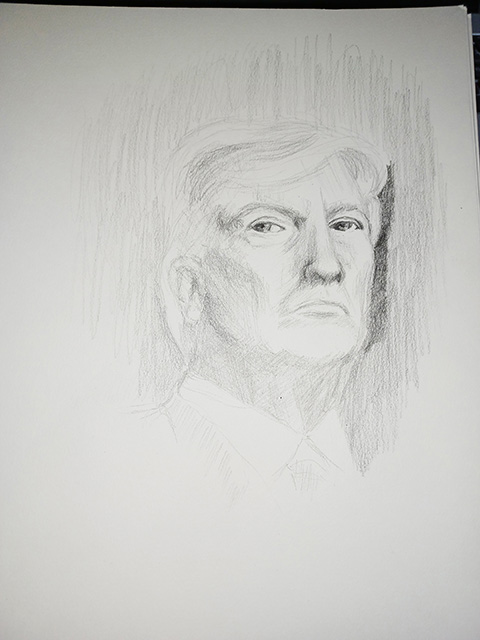
I don’t usually do artwork that is commentary on political events. It is just not my usual thing. However, recently, the way things have been going in the American political system, early this year I felt the impulse to do something that was indeed commentary on the person who was seeking to regain the most important office in America.
Donald Trump is not a portrait subject that would usually appeal to me. Aesthetically, his is not a face that I find an interesting challenge for its planes and shadows (unlike, for instance, Patrick Stewart). However, as various photos of him in different circumstances flashed by me, I would occasionally see shots that were obviously snapped at unguarded moments, where he was not posing for the photographers. The images exposed the inner contempt the subject has for the people and things around him. It’s a cold, remote expression, as if he is removed and above the rest of the world. I wondered if, as an artist, I could catch that aura in a drawing.
So, one day, I just got out my art paper and pencils — because I like doing portraits in pencil. I had searched for an image that held all the attitude, and so began with that. The final image I had in my head, was the image of Trump looking out to one side, over an image of the attack on the Capitol Building on January 6, 2021.
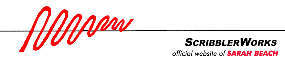
The first thing I found was, as I noted above, the fact that his face doesn’t have many strong, dramatic planes or shadows, that make working from the “negative space” easy.
In fact, just before I took this progress photo, I almost gave up on it because I didn’t think the details were working out. But I focused in on what negative spaces there were and worked from there.
For those who are not familiar with the concept of “negative space,” they are the dark spaces. As the artist, I try not to focus on what that dark space might be, but rather just the shape of it and where it is in relation to other shapes.
By pushing forward that way, I reached this point, and realized I was on the right track. It was coming together. I also discovered a key to the expression I was working to capture. It lies in the positioning of the eyes. Once I got this much done, I looked at it more closely, and noticed that the pupils do not focus on the exact same point. The one on the right side of the paper focuses on the viewer, while the one on the left looks slightly to the side and beyond the viewer. This discovery did make me wonder if that is really what he does: not exactly look directly at whoever he is dealing with, just creating the illusion of it.
Once I got more of the face laid in, I turned my attention to rendering the dome of the Capitol Building as well as I could. However, I realized that the scale of the dome once it was finished was such that it would make any human figures in front of the building quite miniscule. My intention was to convey the rioting on the steps with the clouds of tear gas billowing up. I ended up having to render the people in a very sketchy manner, implying their presence at the site. I wish I could have gotten more detail of the rioting into the work but given the size of the piece I was working on, it had to be as it ended up.
I titled the piece “Contempt.” This is how it turned out —
Related Images:


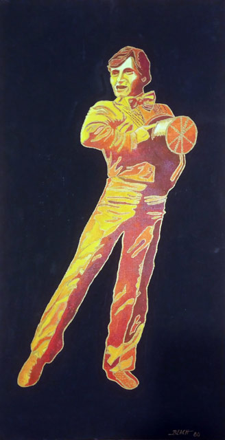 The second painting is one of Mikhail Baryshnikov from a television special he’d done in 1980,


