In updating my website, I’m trying to make sure all posts (or at least most of them) have images attached to them. That’s because Google likes to find images with posts.
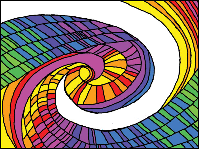
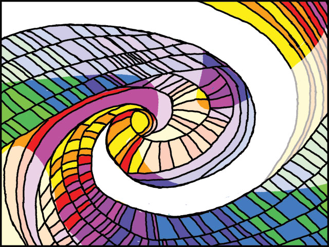
So today, I created a piece of digital artwork for an old blog post. Because it involved converting a drawing done in saturated colors into a pastel version (on a larger scale), I needed to do a piece of saturated colors first, and then add a layer that would take the saturation tone down.
I admit, I was not focusing on making a dazzling piece of art, just something to suit the post. But when I got done with the saturated version, I rather liked it. So I decided both versions were worth noting here on the graphics blog.
The first version (saturated) I call “Spectrum Pinwheel”.
I then had to add a transparent layer to illustrate the experience described in the blog post. That version is called “Pastel Blasphemy #2”.
It’s interesting how things turn out. I didn’t expect to like the saturated version as much as I do.
Related Images: