This last Christmas, I was finally able to return to a personal tradition of mine, that of designing my Christmas card and having them printed up to send out to my longish list of friends and family. It had been approximately a decade since I had last done it, and of course in that time, certain aspects of the printing industry had changed. Mainly, it meant that having full color cards printed now cost the same as monochrome.
The prospect of doing a full color design excited me, until I sat down and suddenly confronted the differences in thinking of a design that would be in one color against white and any colors I wanted working with any other colors.
And then there was the subject matter of the card: Angel(s), Madonna and Child, Three Kings? What would it be? I decided to go with an angel — for some reason, the concept of an angel announcing the birth of Christ has great appeal to me.
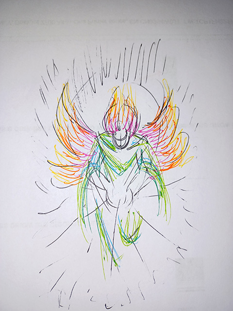
The first step, of course, is to do a rough sketch of what I want. So, this fellow burst in on me.
It’s a very rough sketch, to be sure, but it was the general idea of what I wanted. The wings and hair all fiery, with a gradated black background radiating out from a white center.
I decided that since I had colors to play with, the angel’s garb would be hints of blue-green. For no particular reason, other than I liked it.
In his hands, he would hold a globe of light, with white rays shooting out from it. This would be the “tidings of great joy” that he brings to all people.
The sketch was made in about October, when I was still feeling a bit iffy about whether my budget would allow for doing the cards.
By late November, the budget consideration allowed me to plan to do the cards (although the actual cash flow ended up falling into place only in mid-December, which made for adventures in card stock that I don’t need to relate here). In any case, it allowed me to turn to my lovely 16″ Cintiq and begin working on the actual design.
The first step was rather simple — the basic background of the circular gradation from white out to black. But what I really wanted was an oval shape, so after the first step came the image distortion to get that nice, elongated oval. Easy-peasy, compared to what came next, the wings.
My first attempt at the wings was doing them in long strokes in three layers: yellow on the bottom, extending the farthest out, then orange, then red. Unfortunately, they looked awful, very sketchy and rough. Yuck. It didn’t have quite the dazzle I wanted. I disliked it so much I deleted those layers (instead of keeping them as samples of my own “bad work”). Then it occurred to me to go back to my old stand-by: stippling. I hadn’t really done much dot-work in multi-colors, but this seemed to be the time to really pull that out.
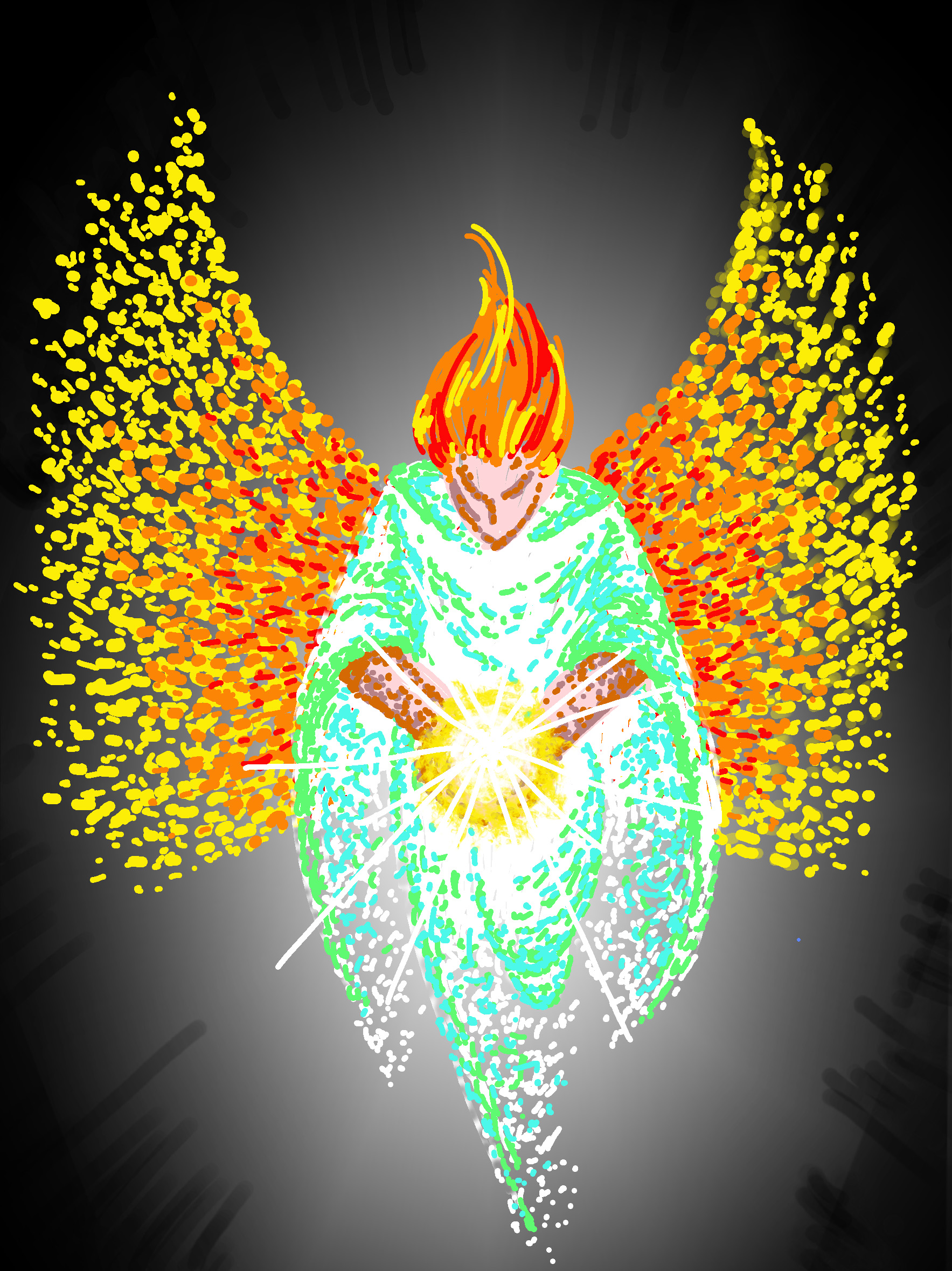
Placing the wings and then the angel figure over the black background really popped visually. I was satisfied.
The globe of light allowed me to play with some fire effects brushes I’d gotten for Photoshop. The initial layer of it was a somewhat transparent yellow, and then a second, slightly smaller white layer using the same brush over that. And then of course the rays.
All in all, it looked pretty good. I sat and stared at it for a bit, happy with what I’d done, and almost — almost — feeling that I had finished it. But there was something nagging at me. Something that made me feel this was just a shade flatter than I wanted.
It needed something more.
Then I realized what it was. The flat background gave me no sense of place. It needed some stars in the corners. Just a little bit. Thus, I reached the final image.
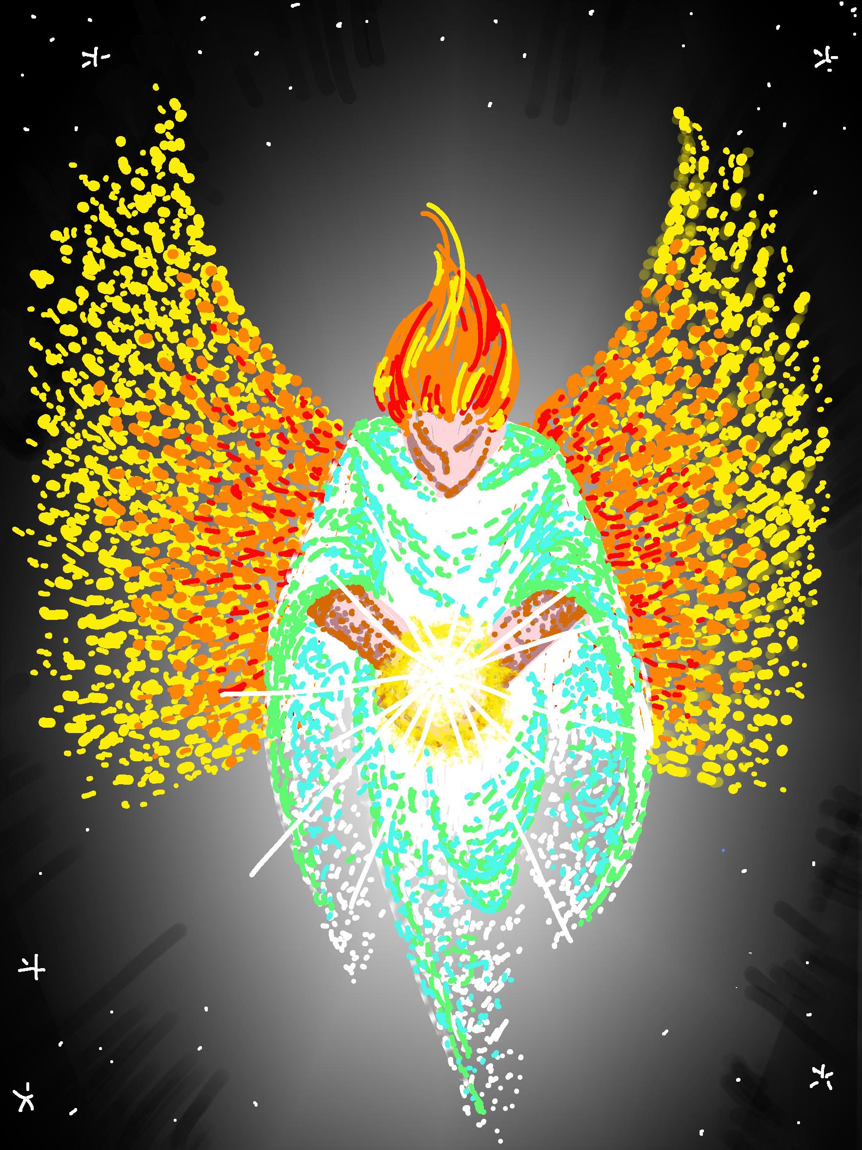
The sprinkling of stars gave the whole a sense of depth, of the angel coming into a place. And that was what I wanted.
I described the image to a friend this way: I wanted to create a sense of a creature of light manifesting into our worldly dimension — and the message of good will and peace being like light made into a physical object that he was holding out to people.
Related Images: