(Originally posted on LiveJournal)
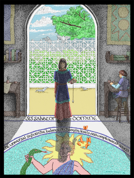
I’ve been working rather intently on the first draft of a script recently, and when I needed to take a break from it, I have worked on coloring an old pen & ink drawing in Photoshop. It’s one I did for Mythlore, based on one of Charles Williams’ poems, “Taliessin in the School of the Poets.”
It’s been interesting to start get a greater degree of comfort in using the Photoshop program. I’m still a long way from having a mastery of it, though.
In the meantime, I’ve uploaded a version of the finished colored piece — hope it interests you all!
Comments
wellinghall – Jan. 16th, 2011
I am very impressed.
scribblerworks – Jan. 16th, 2011
Thank you!
I’d always been fond of this piece. Coloring it was an interesting experience. What amused me most was that I went and checked the text of the poem after I’d finished the coloring. I was pleased that I had the right coloring for the butterflies.
Williams is a real challenge for illustration. And doing the poems, for me, required inclusion of text in the design.
I’ve only scanned a few of the old Mythlore pieces so far. That’s going to take a while.
wellinghall – Jan. 16th, 2011
May I send it to my father in law? He is the secretary of the Charles Williams society, and I’m sure he would appreciate it.
scribblerworks – Jan. 16th, 2011
Certainly!
I’m thinking of putting it on blank notecards from Zazzle.
wellinghall – Jan. 16th, 2011
That would be a good idea.
scribblerworks – Jan. 17th, 2011
When I get everything up and running, I’ll be letting everyone know.
😀
Lots of artwork for me to play with.
sartorias – Jan. 16th, 2011
That is lovely! The tiles–wow!
scribblerworks – Jan. 16th, 2011
Thanks!
The tiles were outlined in the original, and I could have left it that way, but I sort of liked the idea of implying the white grout. Call it an obsessive reaction. 😀
(Anonymous) – Jan. 16th, 2011
Did you use the paintbrush? Techniques???
scribblerworks – Jan. 17th, 2011
I used several different methods. All in layers of course.
Some of it was selecting large sections and just filling them with a flat color. Tweaking with paintbrushes and pencils in the program of various sizes.
Putting some of the details on a different layer. Such as the latice fence in the background. Opaque white for the fence and doorway frame in a layer that went over both the floor, greenery and sky layers.
The deep shadow was done by making a dark transparent layer and then just cutting away everything that was not shadow. That added to the stippling in the original gave me the contrast I wanted between the shadows inside and the bright sunlight outside. It was then just a matter of adjusting how transparent to make that layer.
I wanted the butterflies to stand out a bit more, color-wise, though. And that brought me up against one of the realities of coloring older works in Photoshop. You make a copy layer of the original, make it as transparent as you can, and still get the impression of the ink-work. But the whites of that layer still tone down the saturation of the layers underneath. Makes me a little nuts, because I LOVE saturated colors. The answer for the butterflies was to do most of the coloring on the lower layers, and then the saturated highlighting on the final top layer. The phrase in the poem referring to them was (from memory here, so I’m not claiming it’s exact) “the golden weight on butterfly wings”. Of course, Williams was being metaphorical about poetry in using that, but for an illustration I thought “Oh, throw them in visually. Why not?”
I sort of wanted to edge the lettering, on at least the “sis salvator domine”, with a metallic gold effect … but I haven’t figured out how to do it. I expect it would involve using the chrome filter and a color tint layer over it, with a lot of cutting – but it was more work for a tiny detail effect than I was willing to do this week.
Related Images:


Pingback: Coloring “Tsalosha” | ScribblerWorks News